Brought to life: 
How LG cleverly stages its logo

For nearly 30 years, the LG brand has employed a logo shaped like a face. With the latest relaunch it has become a lively interactive element. Pretty clever, says design columnist Norbert Möller – even if the look of the campaign does have a few kinks.

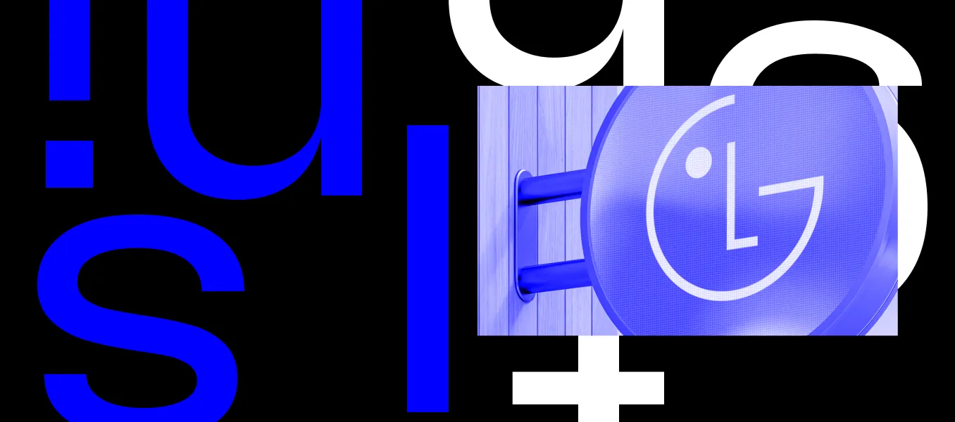
Have you ever heard the term “backronym”? It's not a word you hear often. Usually we are dealing with acronyms – when the initial letters of several words take on a life of their own. BNW is a familiar German example, or ADAC. And probably LG, too. The South Korean brand is one of the world's largest manufacturers of household appliances and home entertainment products, and it stands for – well, what exactly does it stand for? One possible answer: The words “Life’s Good” appear right underneath the logo. Sounds logical, but this meaning was actually added to the brand after the fact. A backronym, in other words. Because LG really refers to the merger of the Lucky and Goldstar brands.


I find it fascinating to decode brands and discover surprising facts like this one. I would also like to acknowledge that the reinterpretation the company launched in 1995 was absolutely ingenious. “Life’s Good” as the brand's promise of products that make everyday life more comfortable and convenient, alongside a logo that turns the company's initials into a happy, friendly face – it all fits together so well that is has been in use virtually unchanged for nearly 30 years and is still effective. There are few other brands today with comparable consistency, especially in a fast-paced business like the electronics sector.


New opportunities to emotionalize the brand

In April I heard LG was to going to revamp its brand identity. At the time, there were few images of how the new look would be implemented. There was a new logo animation, and a picture of a billboard showing the familiar slogan in a new typeface against a red background. That was not enough to be able to make a serious assessment of the new visual identity. But now a global campaign has been launched that focuses on the “Life’s Good” tagline, and the basic elements of the new brand design can be found on the LG website.


At first glance, not much has changed. And quite honestly, it's a huge stroke of luck that the company didn't opt to reinvent itself. Instead, it is reinforcing its strongest assets: the color red, the brand tagline, and above all the logo, which has finally been brought to life in a variety of animations. It reacts subtly to movement patterns without becoming too playful. It seems obvious to me that if your logo has a face, it can take on different facial expressions and thus convey emotion, making it possible for the logo to be used interactively on digital screens, for example on the displays of household appliances. The logo itself can provide users with feedback and emotionalize the brand.


Something about the logo colors bothers me. The basic color is still a dark red – the brand color is called Heritage Red – that is always used when the logo appears within a circle. But other than that, it looks like anything goes, including the use of color gradients and brighter shades of red, for example. When Active Red is used, I find it clashes with the dark red.


Same font, same colors – and do we even need the letters LG when the smiling face already says it all?

Plenty of optimism, a few stylistic breaks

And the rest of the brand elements? The new, old “Life’s Good” tagline has been imbued with new meaning. More than just a tagline, it dominates the entire relaunch campaign. For me, the optimism seems somewhat exaggerated, but that may be due to German restraint or Hanseatic humility. As a global campaign, “Life’s Good” at least provides a stance that can be communicated across all markets as well as internally.


The bold serif font, however, breaks with the other design elements. It's difficult to recognize that it's supposed to be based on the shape of the company's products, and its inclusion in communication media creates competition with the logo. Different styles suddenly come together and don't seem to want to come together – the smiling face of the delicate LG monogram, next to the bold grotesque lettering, with the tagline set in Antiqua bold, and two different shades of red to boot. Shouldn't this have been an opportunity to harmonize the design elements? Same font, same colors – and do we even need the letters LG when the smiling face already says it all?


The new layout system is remarkable. It's kind of a modular tool kit featuring shapes based on the contours of LG products. It is certainly debatable whether rounded corners are still up to date, or whether all the products even really have rounded corners. But it makes the layout look inviting and friendly. Not the worst thing for a consumer brand. The color system is also clever. It stipulates the use of the original dark red and the new light red, along with black, white, and light gray, and it facilitates weighted handling. But what good is a guideline like that when it is ignored the first time it is used? The implementations in the launch campaign are dominated by the light red. And sure enough, it just looks better.


How does the brand contribute to the “good life”?

LG cleverly interlocks its campaign with interaction mechanisms on social media. Instagram filters and stickers are intended to help anchor the brand in the world of the young target group. There are also testimonials and two animated 3D characters called Joy and Rider, who display the typical heart gesture that originated in K-pop. All that is perfectly understandable for me, but we also know that Generation Z in particular has high expectations of brands and a keen sense of whether strong claims can really be substantiated. “Life’s Good. It's just two little words. But it's an idea with real power. Because those who dare to believe it are the people who change the world.” That's what it says on the campaign website, which closes with this call to action: “Share the love-filled heart challenge – Share your ‘Life's Good!’ moment!” I would actually be interested to learn more about LG's initiatives and achievements. How is the brand contributing to “a better life and a better future”? The campaign will only gain substance if the brand can provide answers to this question soon.


The latest contributions exclusively on W&V:
This design column by Norbert has been published on W&V online. As a W&V member, you will also find the latest articles from his series there.

Meet the author

Norbert
Executive Creative Director

Mail to Norbert