Once a love brand,
always a love brand?
Classic brands often face pressure from new challenger brands – unless they keep up with the times. Portugal's favorite brand, Delta Cafés, shows how it's done. A role model – also for Germany.
Once a love brand,
always a love brand?
Classic brands often face pressure from new challenger brands – unless they keep up with the times. Portugal's favorite brand, Delta Cafés, shows how it's done. A role model – also for Germany.
Jacob’s Krönung did it. Lavazza did it. Delta Cafés has done it, too. They all dressed themselves up nice and fancy, just to attract attention on supermarket shelves. But was all that expense and trouble really necessary? After all, these are well established brands we're talking about, with many years of know-how. And they are genuine love brands, too.
Fact is, they are beloved precisely because they're not afraid to make changes. Classic brands that manage to stay true to their traditions while embracing new values and fulfilling new expectations have a clear advantage. And Delta Cafés, a love brand from Portugal, shows how it's done. Founded in 1961, the company is the pride of the nation, named Protugal's most beloved brand in multiple consumer surveys. It appeals to long-time fans as well as younger target groups. Online and on supermarket shelves. In more than 40 countries.
The question is: How exactly should traditional brands change and evolve? To find out, we conducted a representative survey of German consumers. The findings: Just under a third intend to buy familiar brands more often. Why? Because the world is becoming increasingly uncertain due to war, inflation, and the climate crisis. Many people are longing for continuity, expertise and the “good old days.” Brands that have stood the test of time meet these expectations – provided they understand how to convey their heritage in a contemporary way.
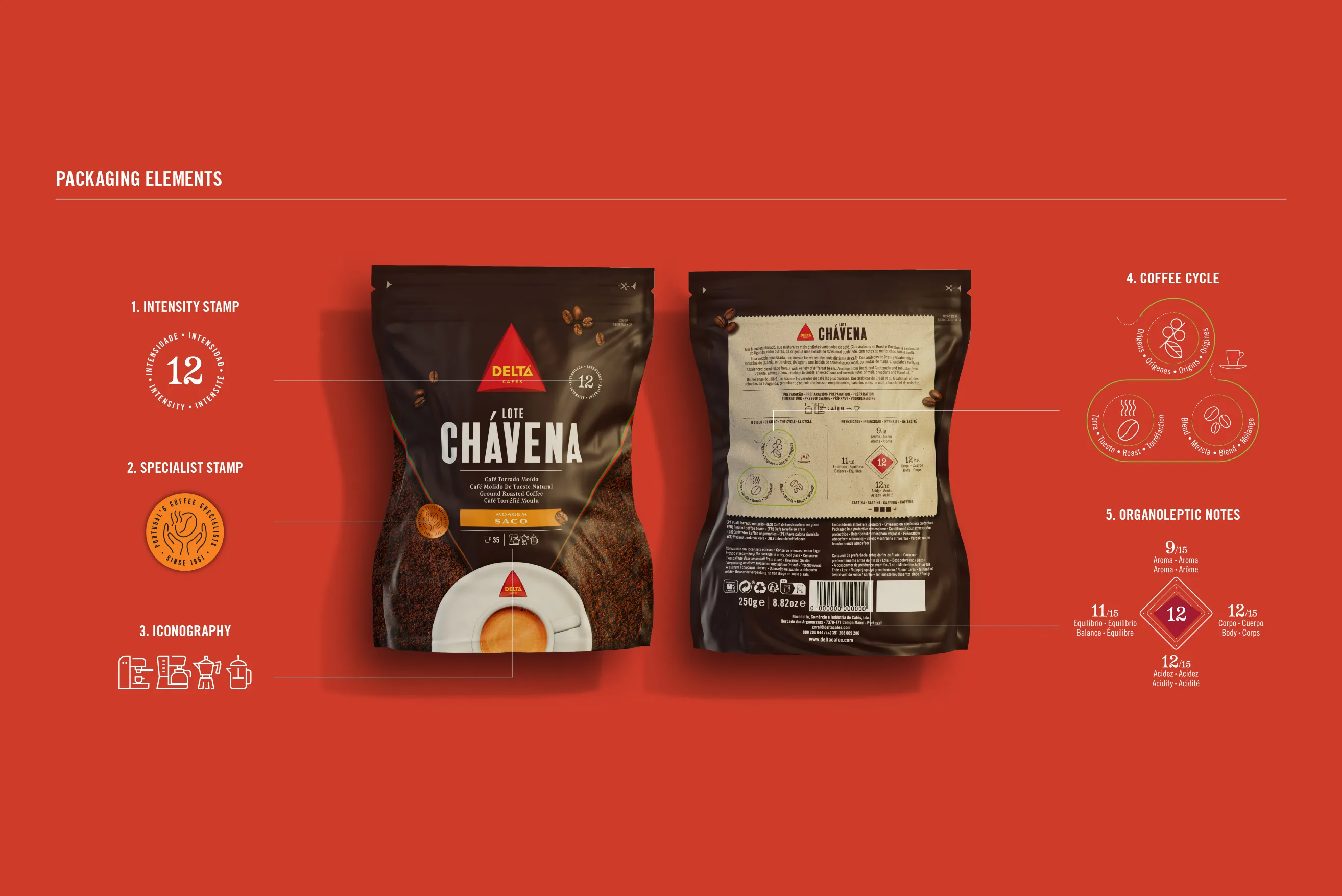
In other words, change is an opportunity! That's why traditional brands should respond to the niche codes of the challenger brands by showcasing their many years of experience. Because the new brands are persuading consumers largely on the basis of perceived “exclusive” characteristics like coffee plants from an unexpected part of the world, or beans that only grow at a particular altitude. Classic brands can counter this with their proven expertise and, like Delta Cafés, provide additional details about taste and aroma as well as the roasting process, grind coarseness, and production methods. Another good option is a visual reinterpretation of “expert codes” such as seals of quality and signatures. Paired with simple, clear formulas and strong colors, they concretize the message and impart a sense of confidence and security.
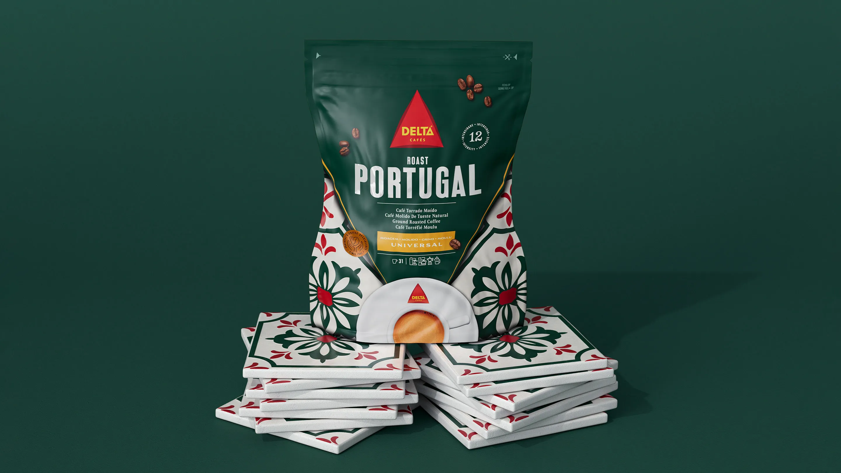
Another way to underscore the feeling of familiarity is by retaining core elements of the brand identity while evolving them further. To this end, we derived an entire design system from the trusted logo of Delta Cafés: The essential information is placed in the middle of an upturned triangle that guides the eye to a steaming cup of coffee. While innovative, the packaging is still characteristic of the Delta brand. And it is even more noticeable on supermarket shelves.
Customers know what they want. And they want it fast. That means the order of the day for brands is reduction and simplification. But what information is really important? For consumers in Portugal, the answer is clear: The intensity of the coffee comes first, followed by grind coarseness and the product's name. All this information must be comprehensible in less than a second.
That's why the Delta Cafés design system includes icons that are easy to decipher, simple and authentic shapes, and an overarching color scheme. All this enables consumers to orient themselves quickly. And not just on the supermarket shelf. More and more people are using their smartphone to shop online. So these orientation aids need to be effective even when the image of the packaging is no bigger than a thumbnail.
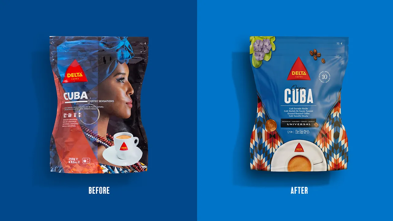
An intuitively comprehensible motif provides a visual reference for the country of origin. Importantly, colors and patterns must be free of bias and derived in an authentic way.
That's why we gave Delta Cafés' Origins range a major visual overhaul. This series of products is made from beans originating in specific growing regions from Colombia to Vietnam. Previously, this information was conveyed with cliche-ridden motifs of individuals. We replaced them with colorful patterns based on the culture of the respective country of origin.
This resulted in another important effect: The colors and patterns are the strongest visual element on the packaging, and they attract customers' attention. While other coffee brands tend to rely on earthy tones, the vibrant patterns set the product apart from the competition and enable quick differentiation between the varieties.
Whether you're dealing with new varieties or new markets, the packing design needs to be flexible enough to differentiate products from one another while at the same time fitting perfectly into the overall portfolio.
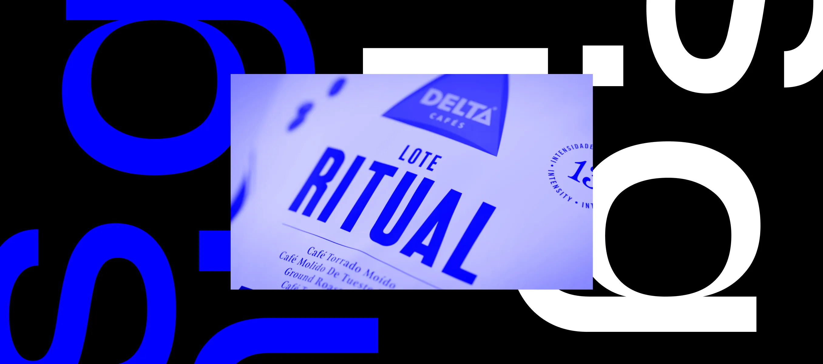
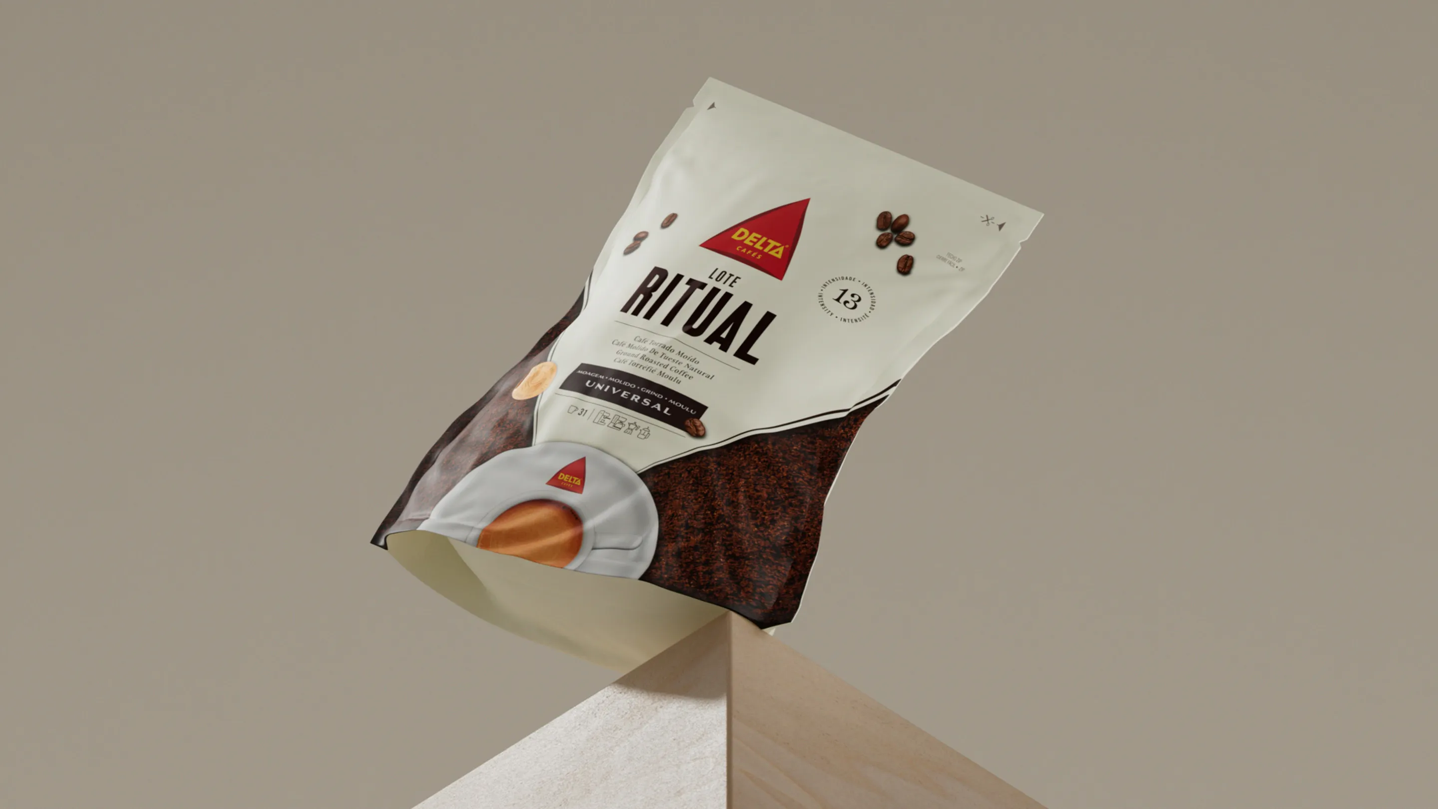
Here too, the new design system for Delta Cafés delivers convincing results, as evidenced by the introduction of the new Ritual range. Available in Europe since the beginning of the year, the design is on-brand for Delta yet stands out visually. When choosing the name “Ritual” we intended to ensure that: 1. the range appeals to a broad target group of frequent coffee drinkers, 2. it reflects the strategic positioning of the product in the brand portfolio, and 3. it is universal enough to be effective on various international markets.
Changing social values offer plenty of room for new, sharply focused brands. But also for established brands that are bold enough to drive change. That's why you should take into consideration both current trends and the constantly changing behavior of consumers. And don't forget to invoke your heritage with pride and determination. All this can be done in various ways, and can be infused into the design of each and every brand. It takes the right blend to make a good cup of coffee. And love brands will always be love brands!
Meet the author
Pedro
Chief Creative Officer
PETER SCHMIDT GROUP