Turning flavor into visual personality
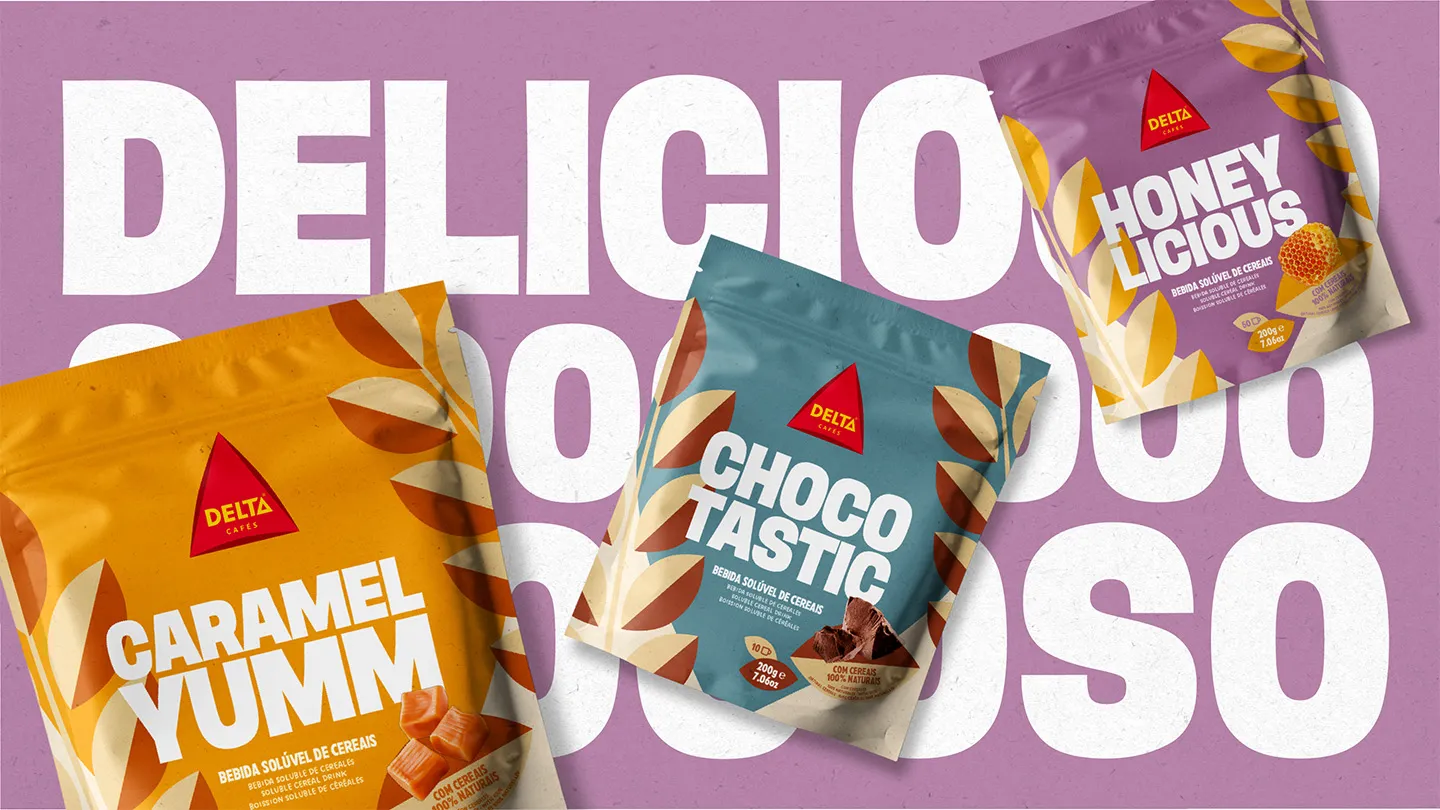
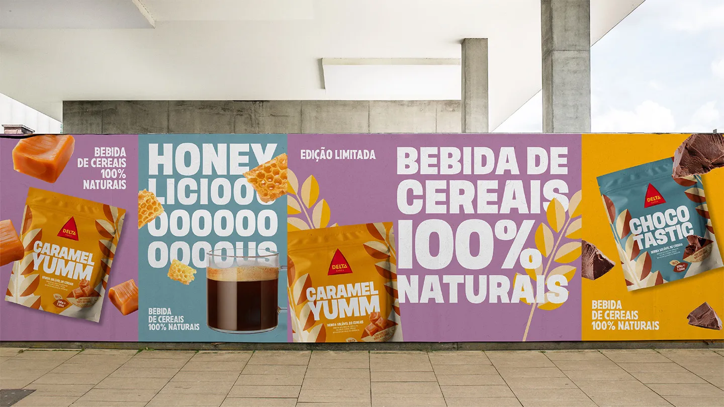
A limited-edition design that embodies the perfect blend of bold aesthetics and playful flavors. For Delta Cafés we created a cohesive and expressive range where names, colors, and typography work in harmony – transforming three individual products into a unified, striking statement on the shelf.
Read more
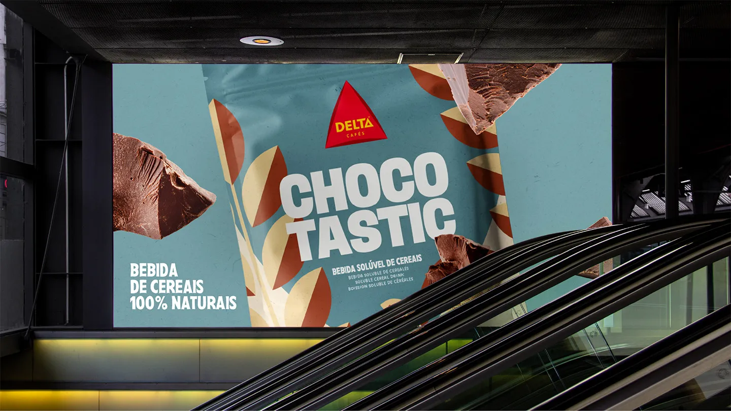
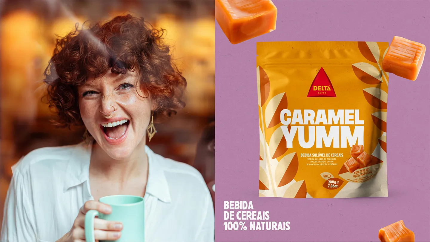
Delta Cafés is rewriting the rules of breakfast. With its new range of flavored soluble cereals, the brand introduces a category that is as expressive as it is indulgent. The Peter Schmidt Group developed the concept, naming, and packaging design for this limited edition – a project that combines flavor, humor, and visual impact.
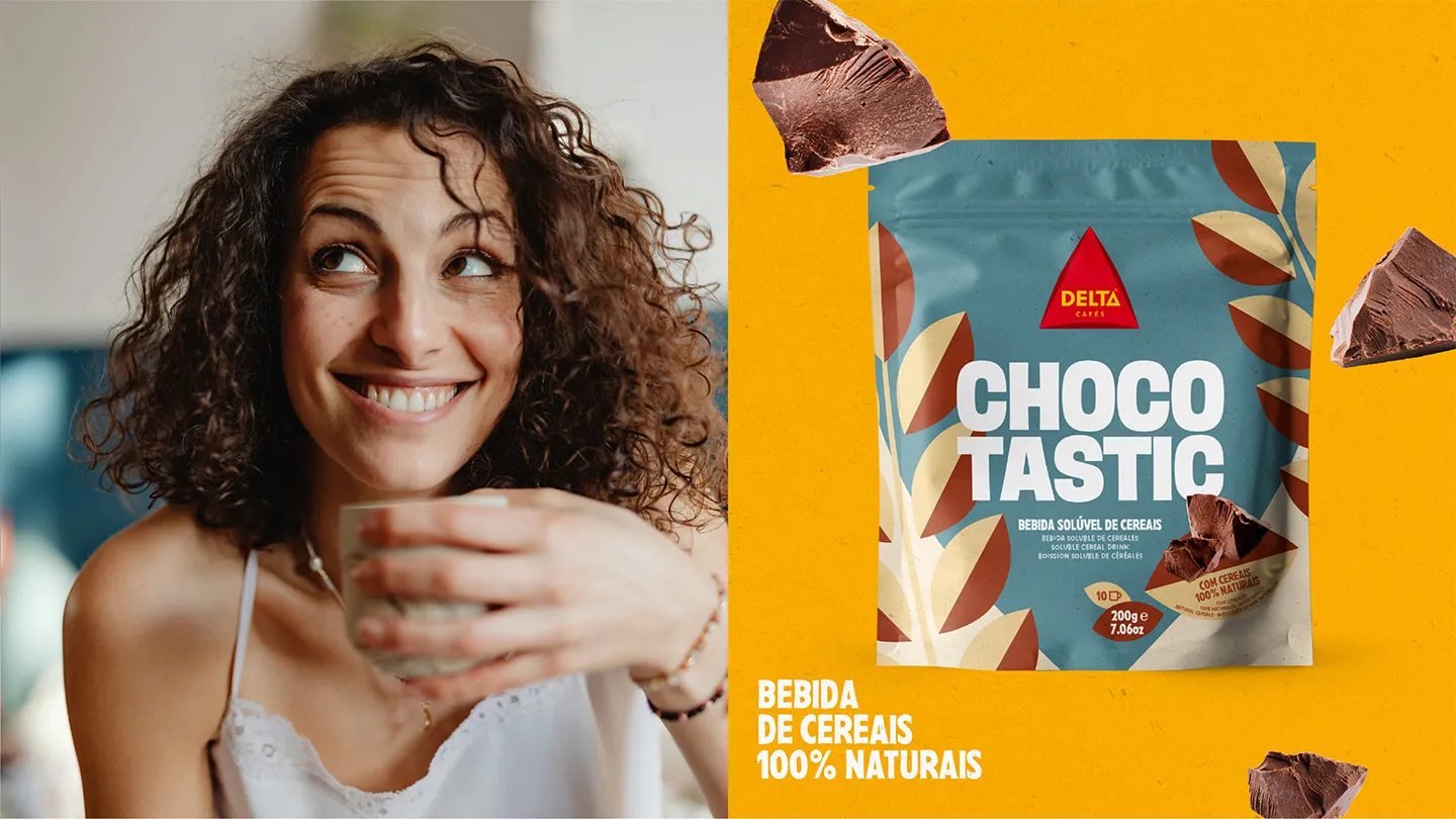
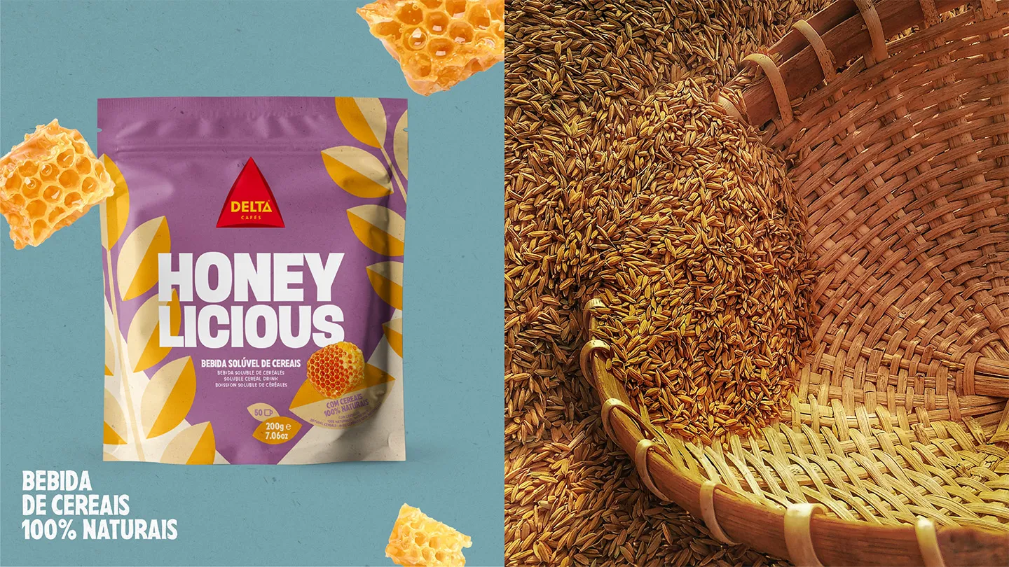
The names say it all: Choco-Tastic, Caramel-Yumm, Honey-Licious. Each one is a playful promise of pleasure, designed to speak to a generation that values authenticity and individuality. Because when the product is indulgent, the name should celebrate it – with rhythm, exaggeration, and a touch of theater.
The design follows the same principle: bold typography, vibrant colors, and highlighted ingredients create a visual language that stands out. Each pack has its own personality, but together they form a striking block on the shelf – a statement that rejects blandness and embraces character. This is not the neutral world of “100% natural” cereals. This is expressive, irreverent, and impossible to ignore.
Our approach reflects a key insight: relevant brands today don’t just communicate – they occupy space, assert themselves, and leave a mark. With this range, Delta Cafés does exactly that. A new way to savor the day, and to say it with style.

Pedro
Chief Creative Officer

Filipa
Creative Director
Next up
Delta Cafés
More shelf impact for Portugal‘s love brand