Refreshing a Portuguese retail icon

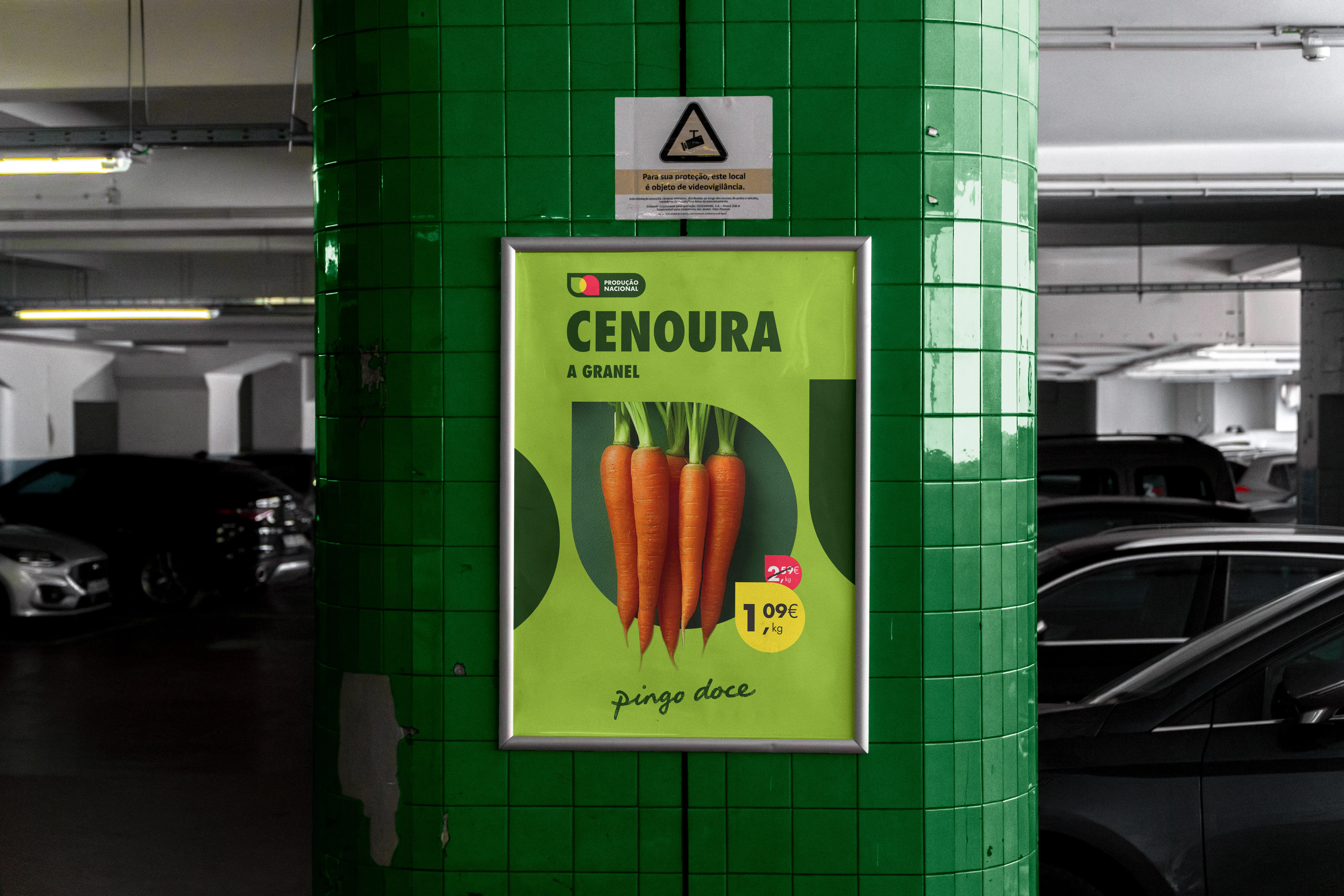
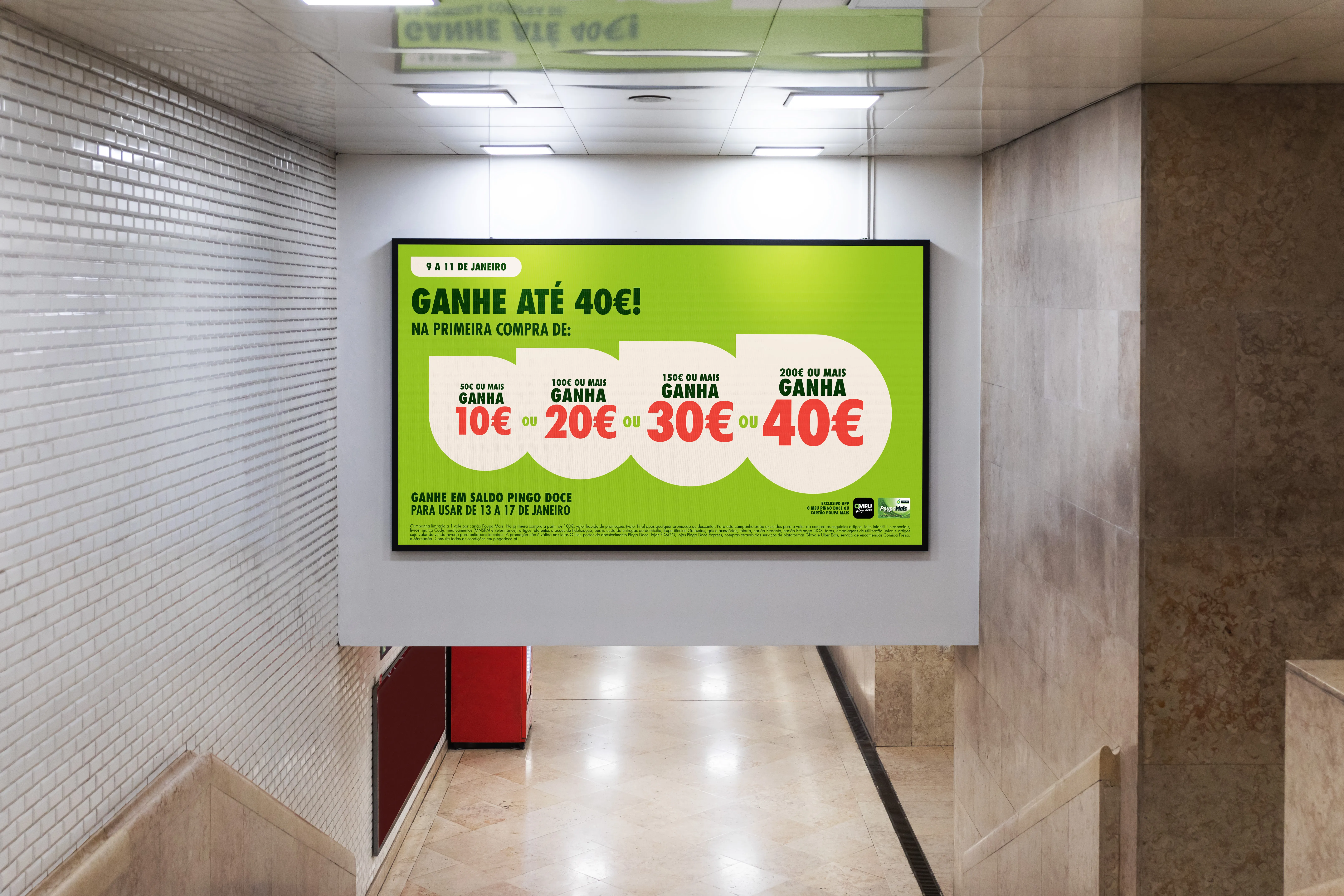
A clear, impactful and distinctive visual identity that structures Pingo Doce’s whole promotional communication strategy. Building on a “swipe” concept that mirrors the experience of browsing the retailer’s extensive offer, we created a flexible and consistent design system that balances recognition with flexibility.

Read more

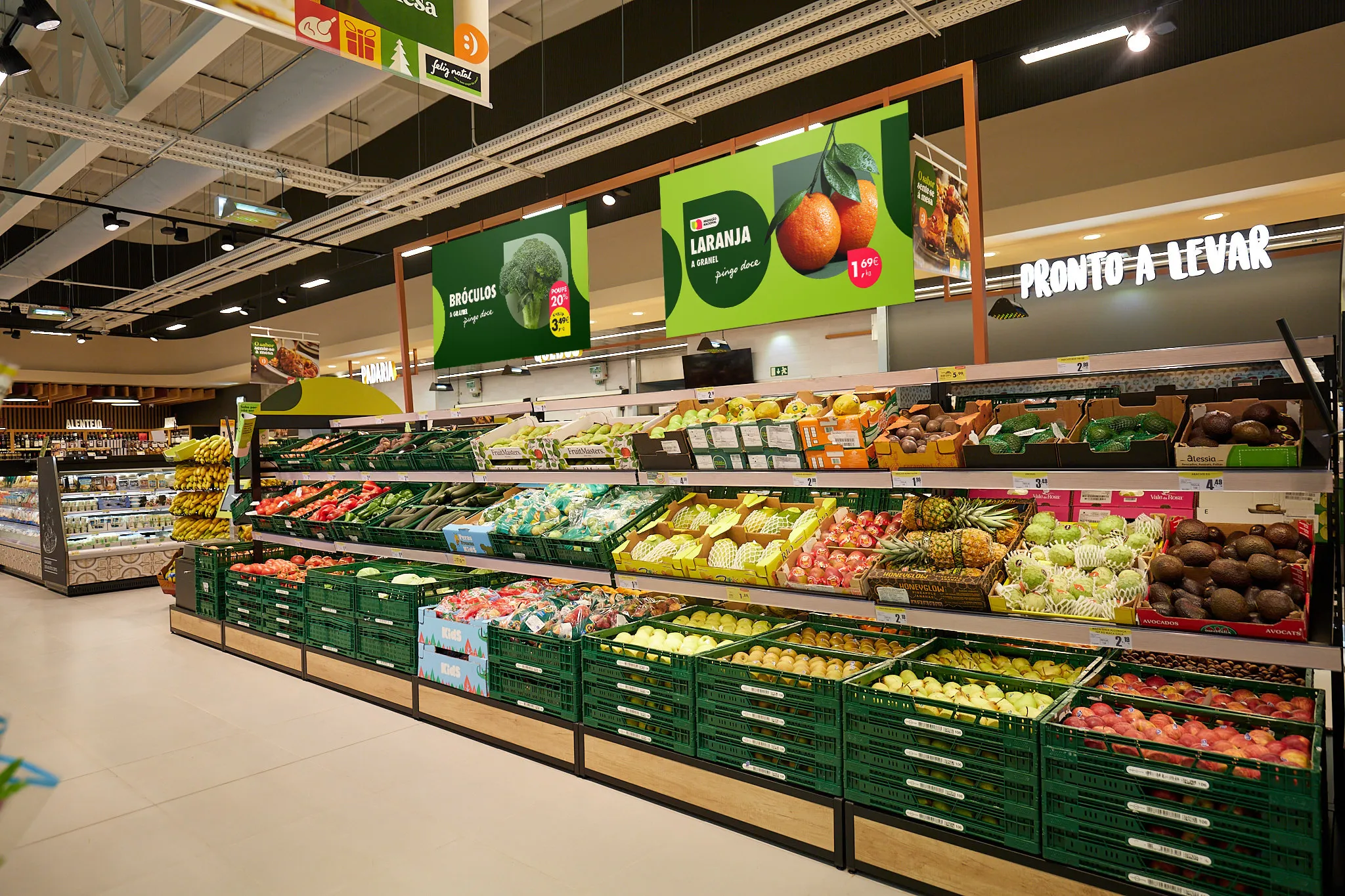
A bold visual language brings sophistication and an expressive character to brand’s promotional universe. It covers daily communication for Private Label and Fresh products, weekly offers and seasonal campaigns, as well as all Price Promotions and discounts.

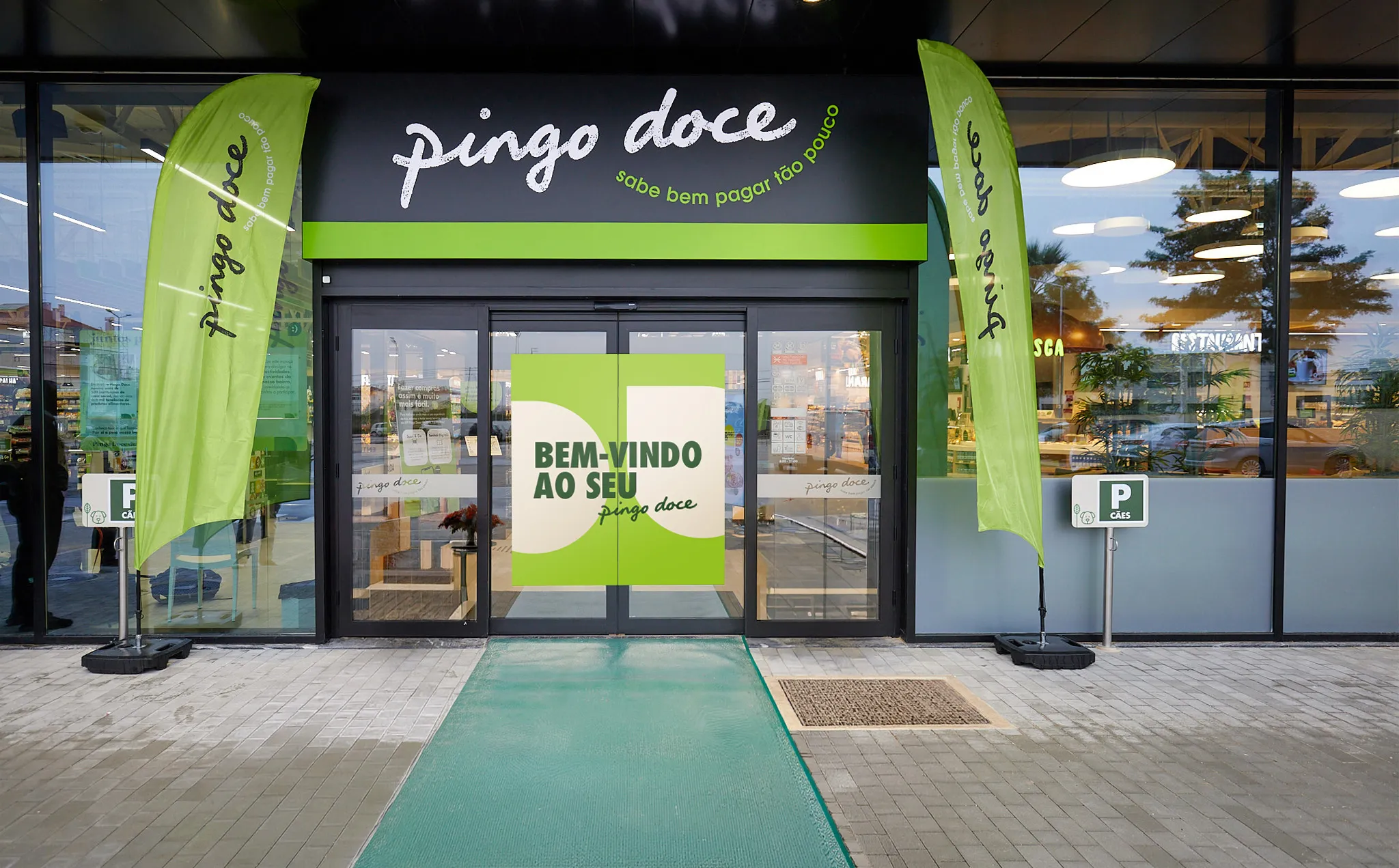
The system ensures coherence across every brand touchpoint, adapting to different promotional concepts, messages and formats, from TV and Social Media to Digital and In-Store communication. Unapologetic presence and character for one of Portugal’s biggest retailers.

Read less

Leveraging the Distinctive Brand Assets to build an unmistakable Pingo Doce character.

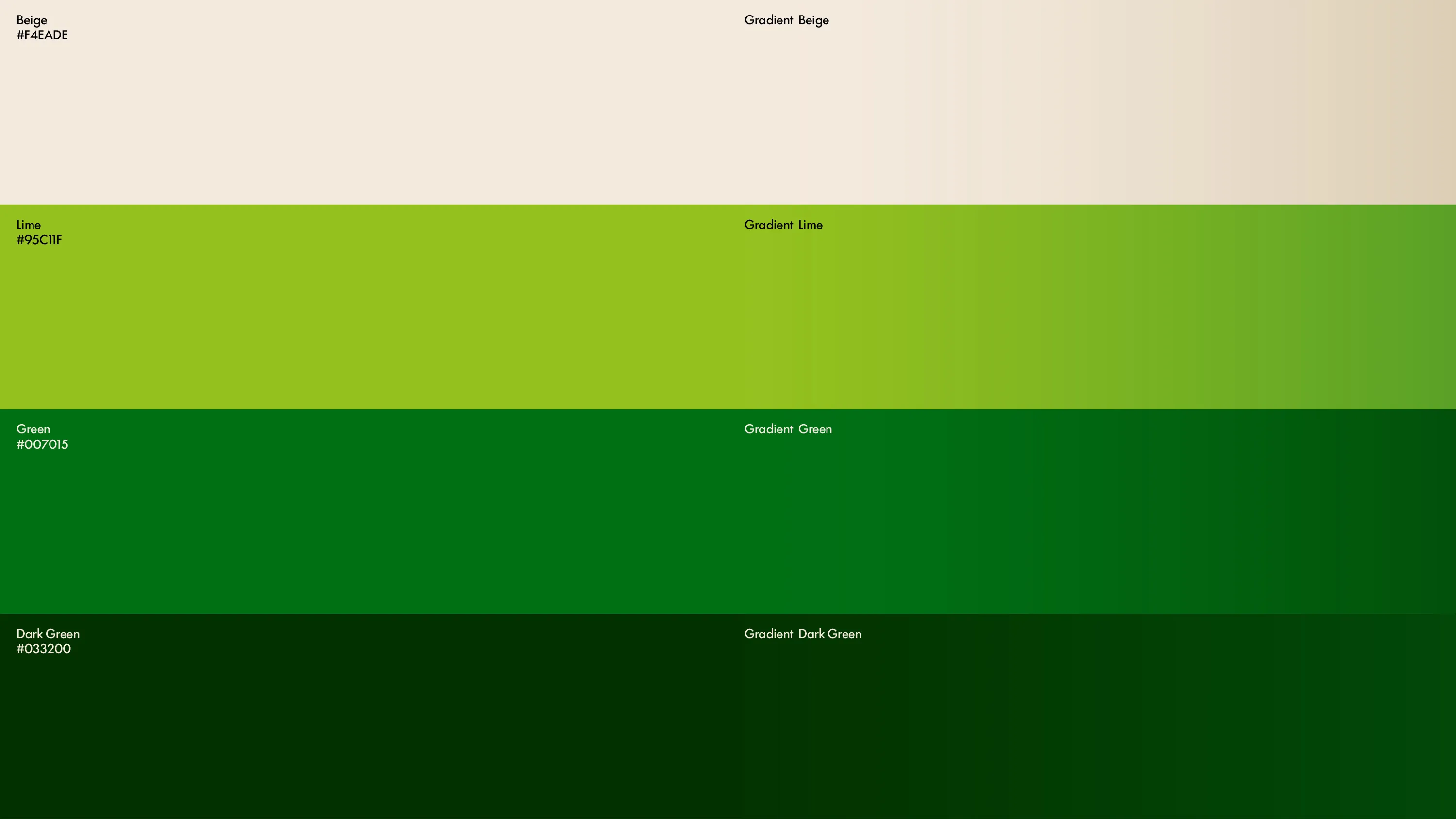
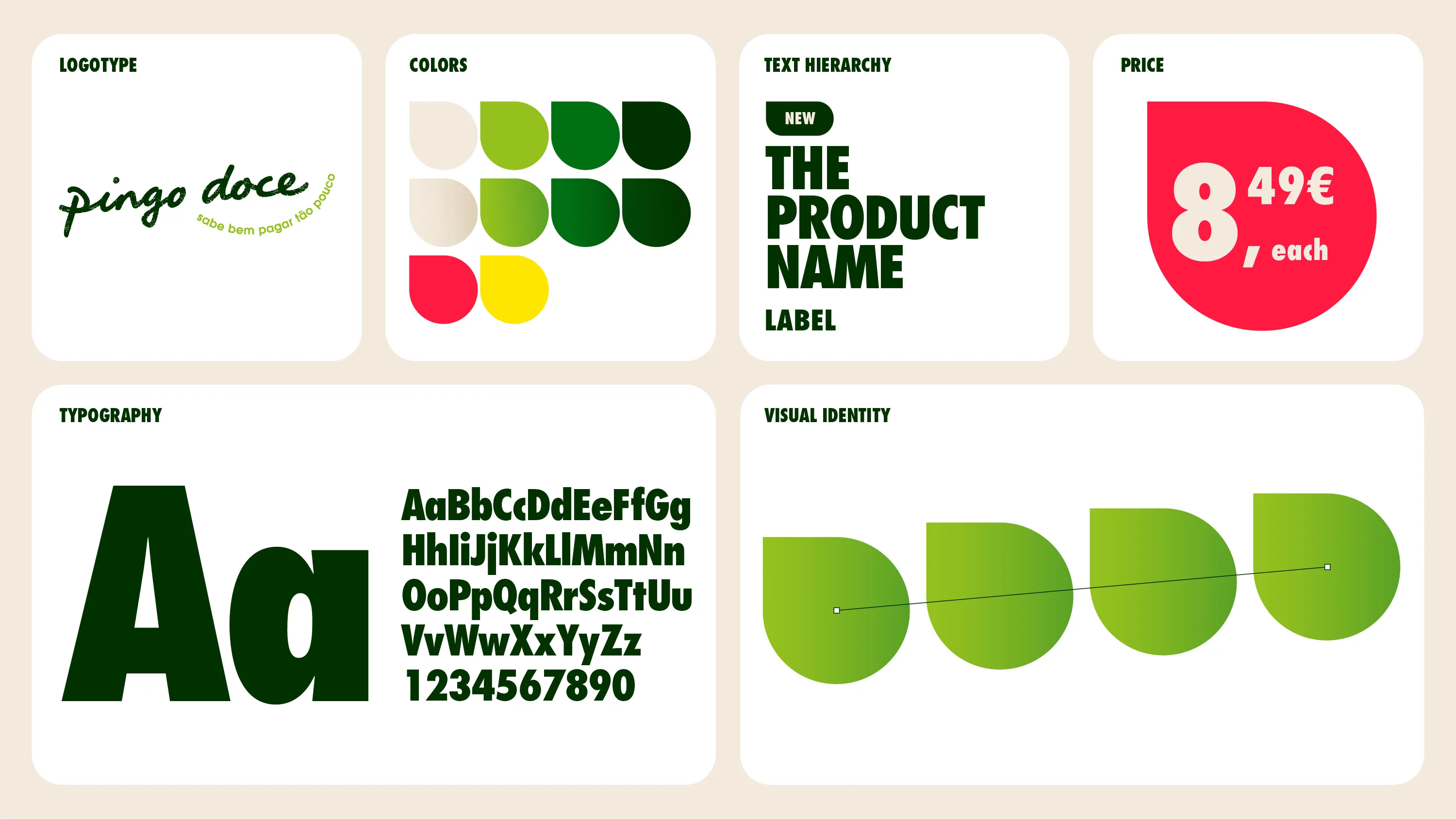
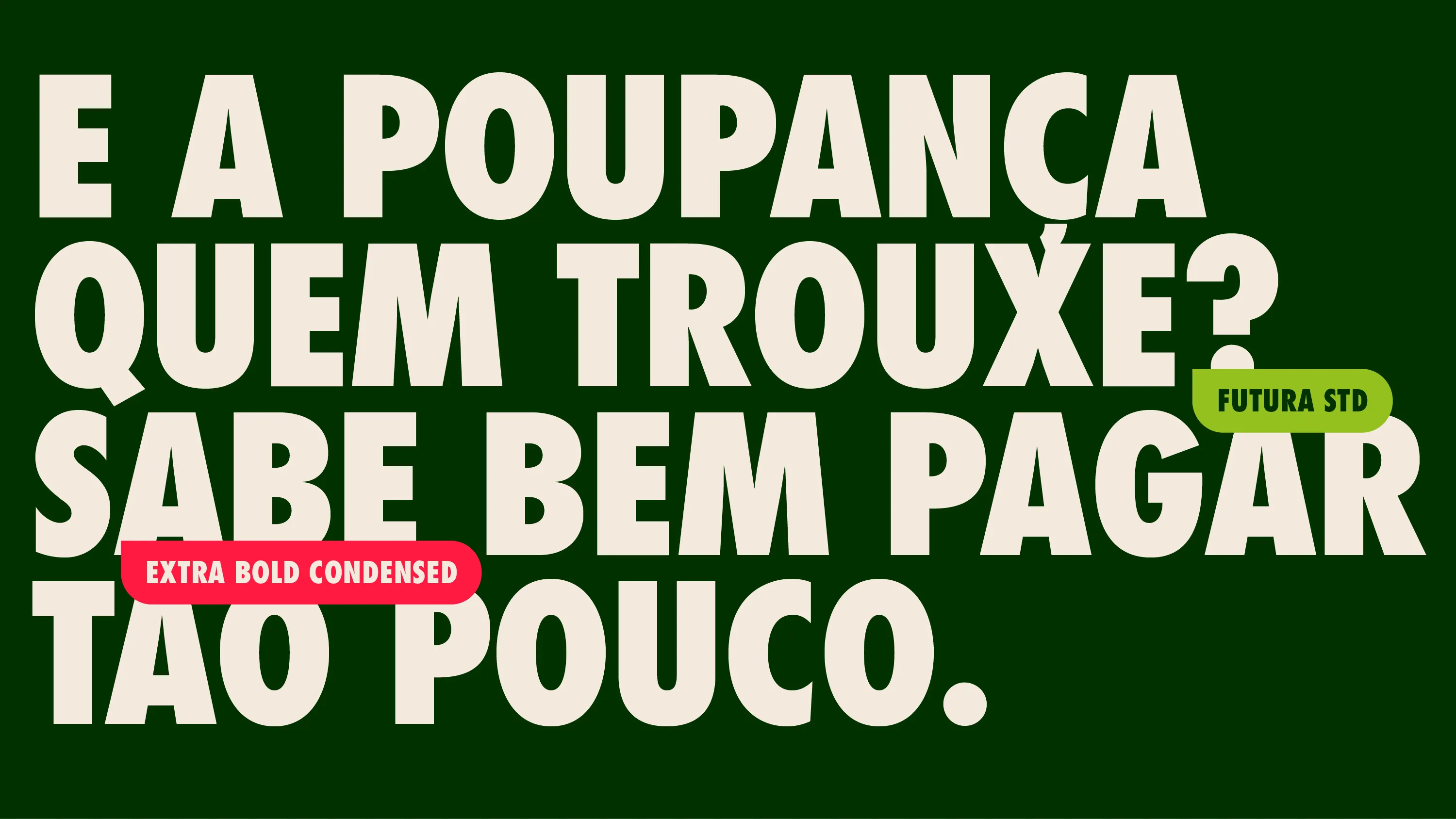
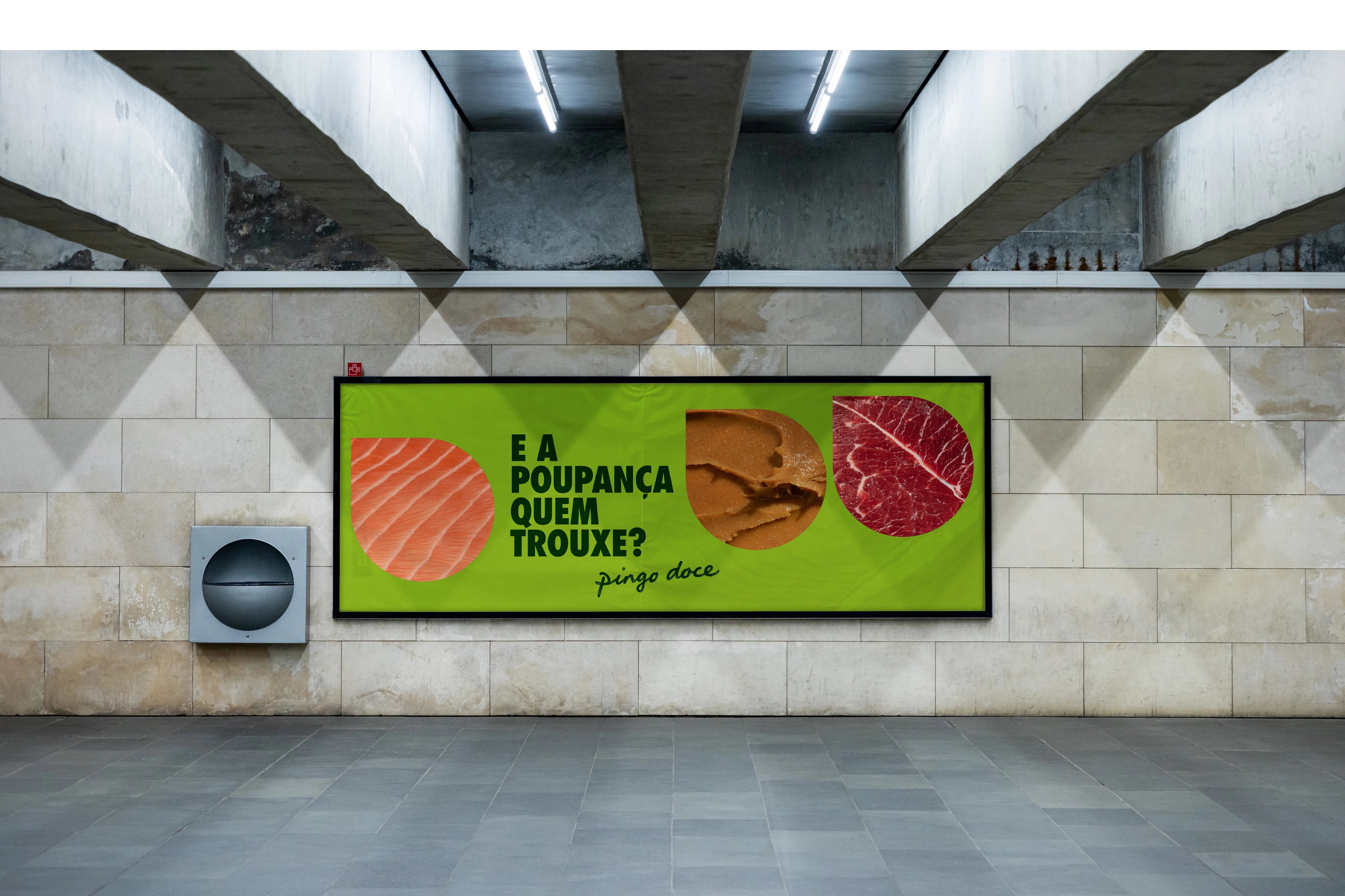
Every detail of the new toolkit was recalibrated. At its core, Futura, brand’s historic proprietary typeface, now plays a bolder, more confident role. The “swipe” visual system is driven by the iconic Pingo, brand’s proprietary graphic device. A redefined colour palette, with clear rules of use, gives each promotional area its own character within one consistent brand. And a new photographic style brings the product closer and fresher, in a contemporary appetite-appeal-driven style.
Pedro
Chief Creative Officer

Mail to Pedro

Filipa 
Design Director

Mail to Filipa