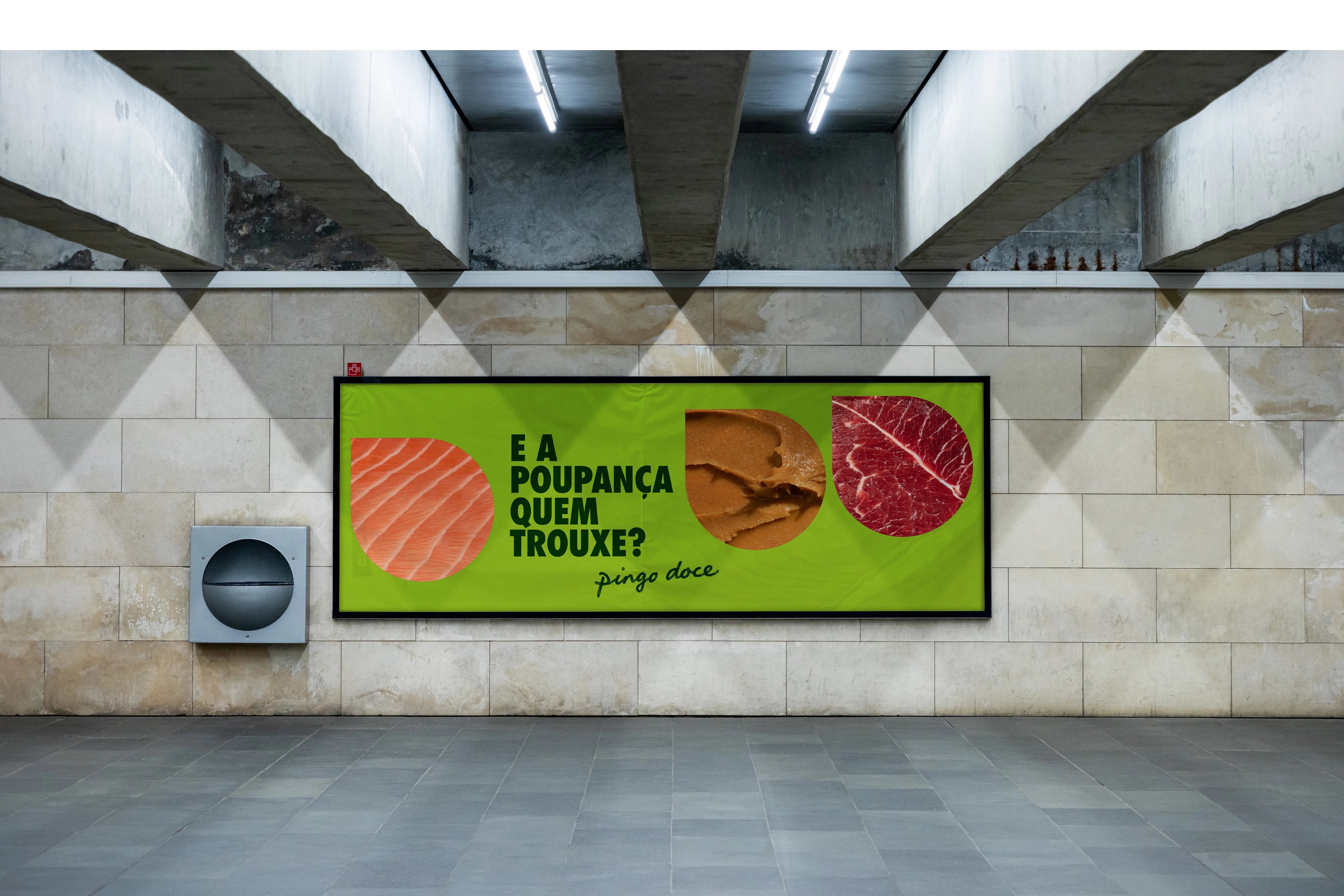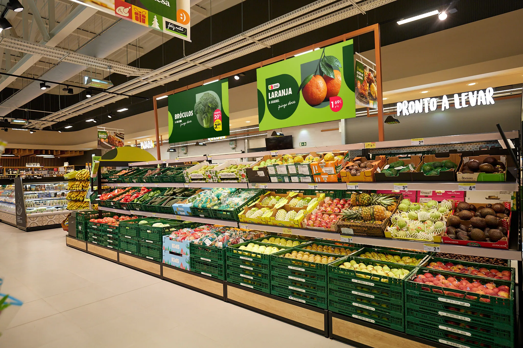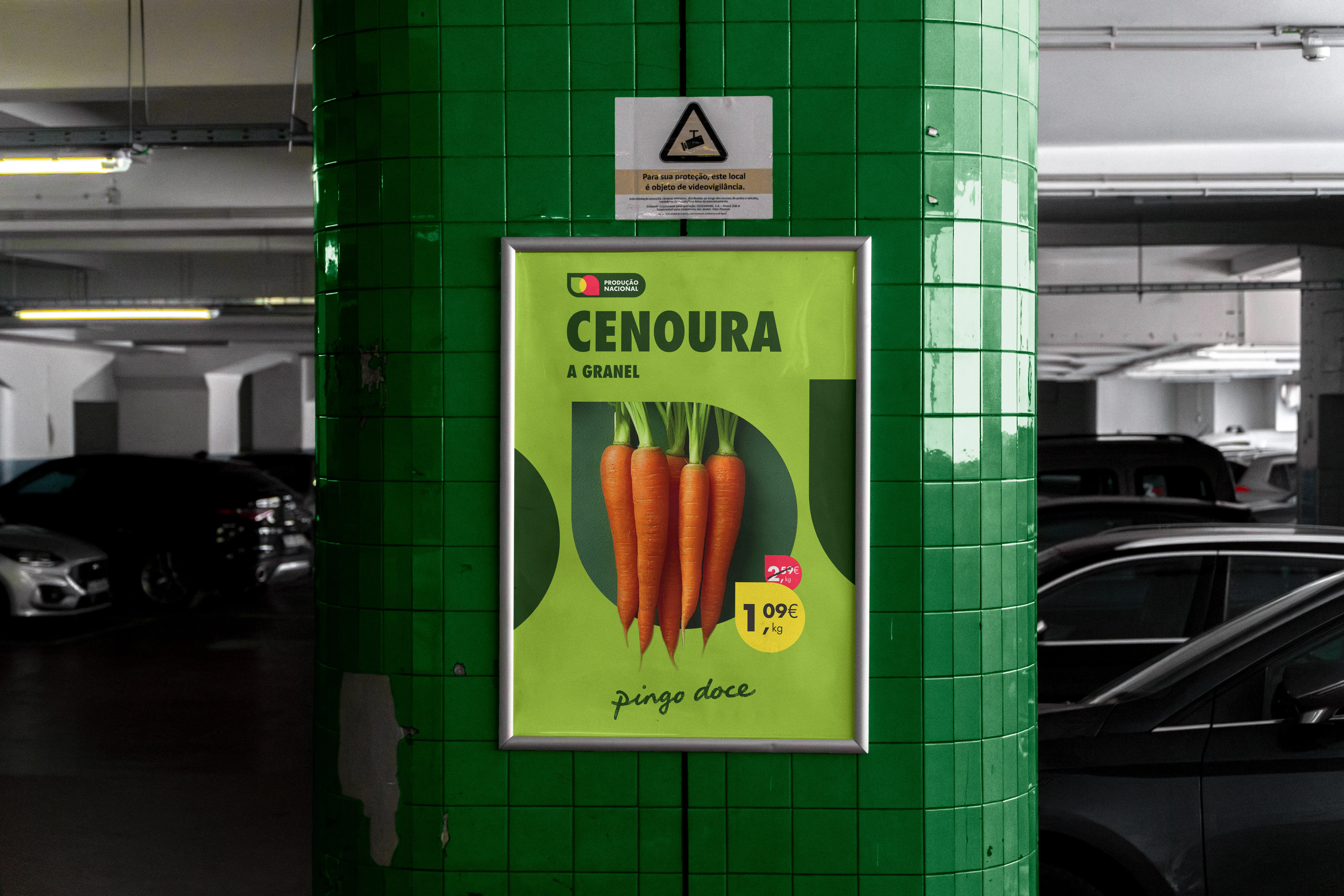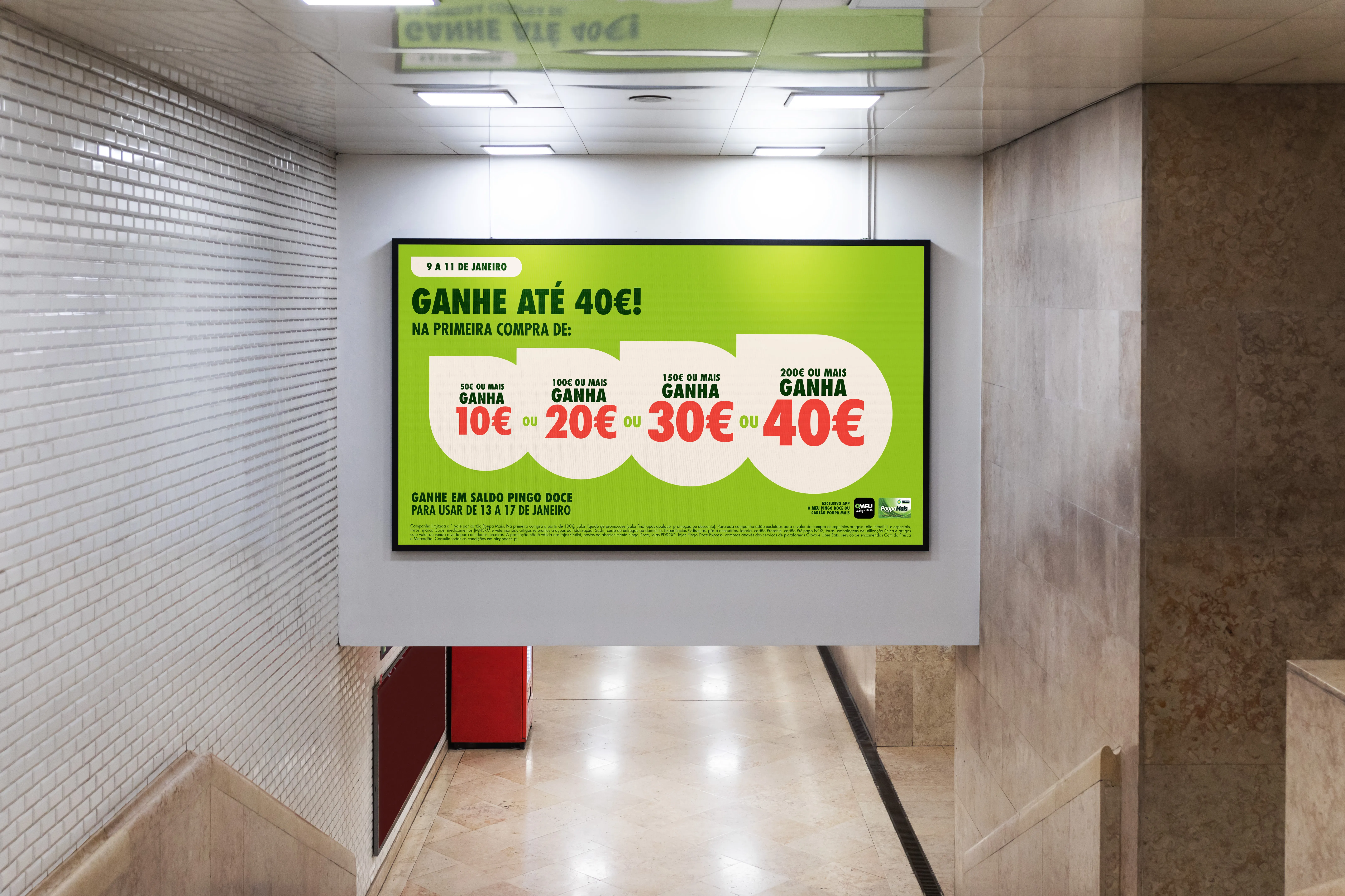
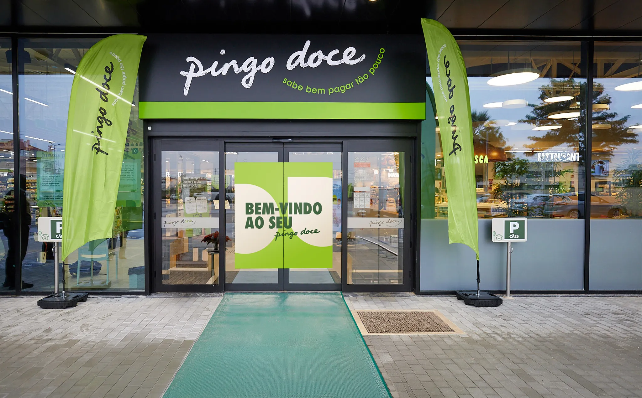
Leveraging the Distinctive Brand Assets to build an unmistakable Pingo Doce character.
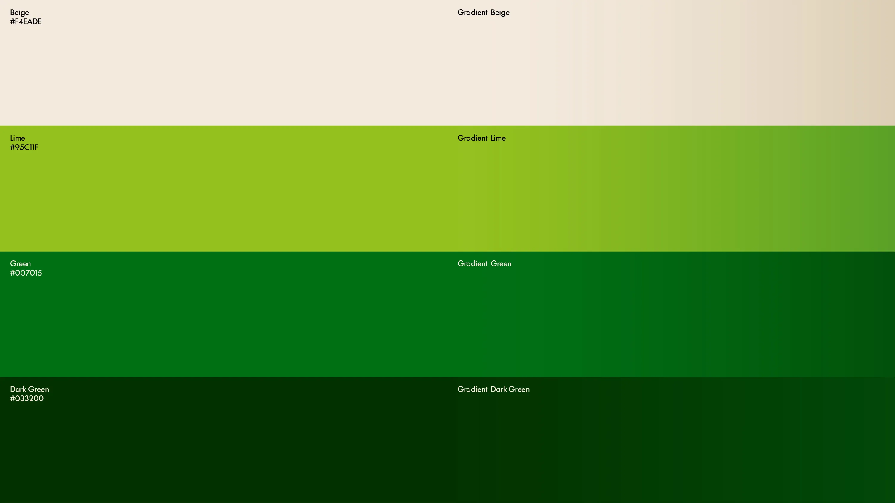
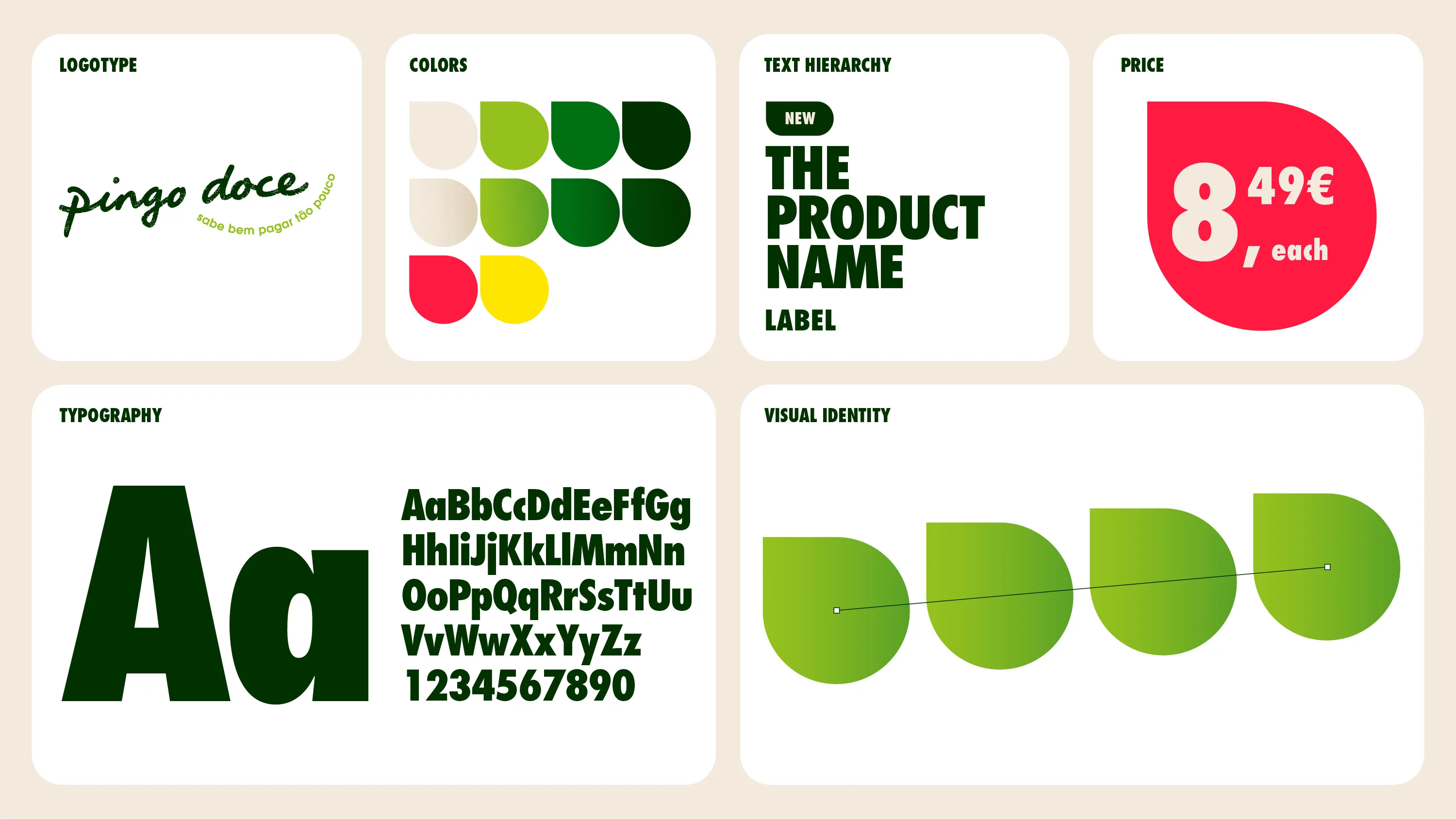
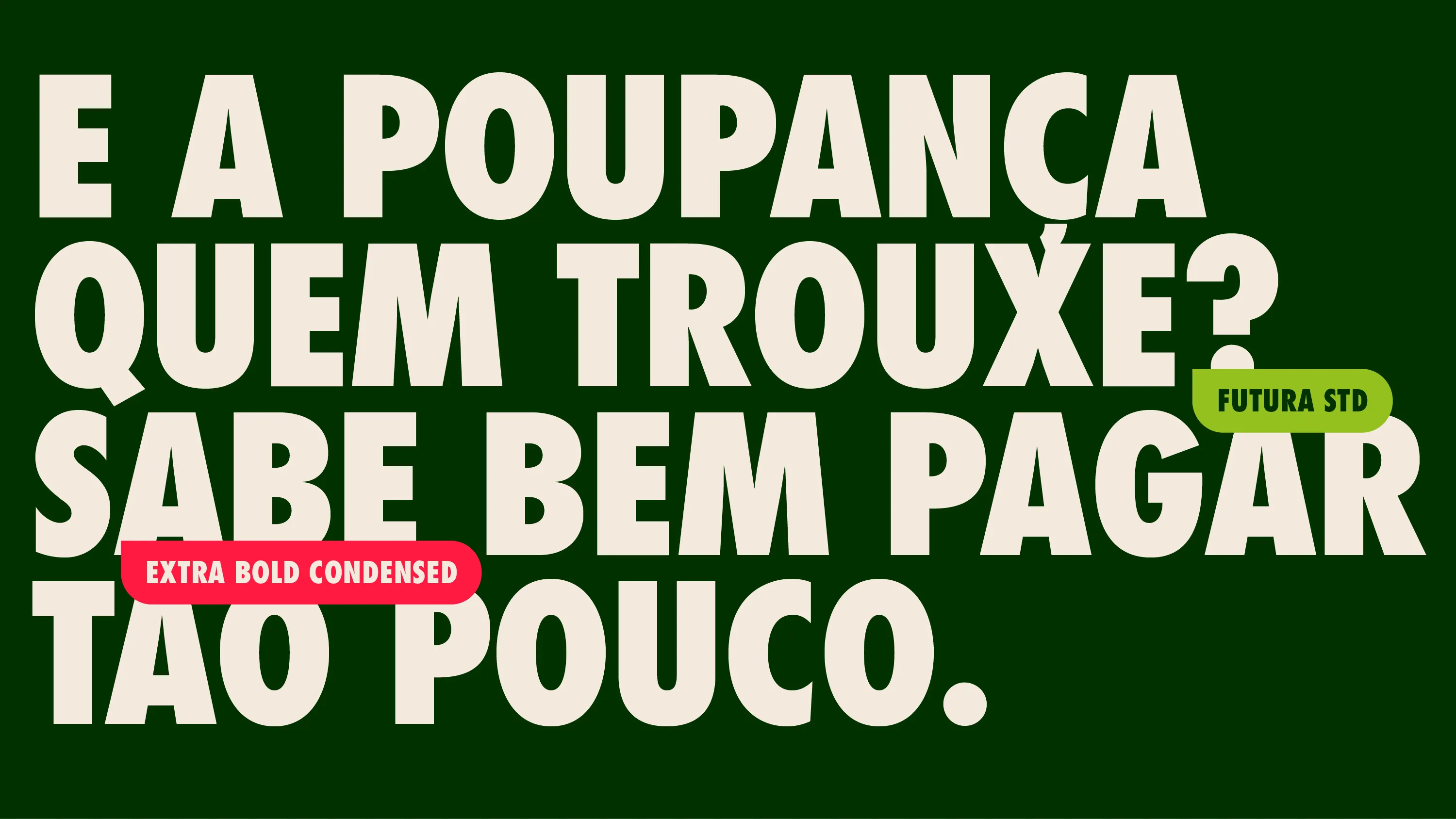
Every detail of the new toolkit was recalibrated. At its core, Futura, brand’s historic proprietary typeface, now plays a bolder, more confident role. The “swipe” visual system is driven by the iconic Pingo, brand’s proprietary graphic device. A redefined colour palette, with clear rules of use, gives each promotional area its own character within one consistent brand. And a new photographic style brings the product closer and fresher, in a contemporary appetite-appeal-driven style.